
Make one idea
unmissable.
Digital billboard creative has only a brief moment to register. Make the message legible at speed and adaptable to the actual screen.
Same brand.
A more timely invitation.
Dayparting assigns approved creative to selected hours. Try the three moments below to see how one restaurant campaign could change through the day.
Coffee. Breakfast. On your way.
Your restaurant · Your destination
Morning creative
Give the morning message one job. A short breakfast invitation can suit a commuter route while the offer is available. Keep the business name easy to recognize at a glance.
Example: breakfast creative assigned to approved morning hours.
Lunch plans, sorted.
Your restaurant · Your destination
Midday creative
Switch the invitation to the next relevant occasion. A lunch message can use the same brand and layout, with the main headline and product changing for the middle of the day.
Example: lunch creative assigned to approved midday hours.
Take dinner off your to-do list.
Your restaurant · Your destination
Evening creative
An after-work message can point toward a dinner occasion. Check the booked face’s travel direction before adding a turn or exit instruction, and keep any offer within the business’s actual hours.
Example: dinner creative assigned to approved evening hours.
Illustrative copy, not an actual client campaign. BYB confirms available scheduling, artwork and delivery in the campaign plan.
One thought.
One clear action.
Start with the single thing a viewer should remember. A short headline, recognizable brand and one visual usually work harder than a miniature print ad. Treat “seven words or fewer” as a useful editing prompt, not a rigid production rule.
A driver may encounter a face from an angle and for only part of its display cycle. Preview at a small size and ask someone unfamiliar with the campaign what they understood in a glance.
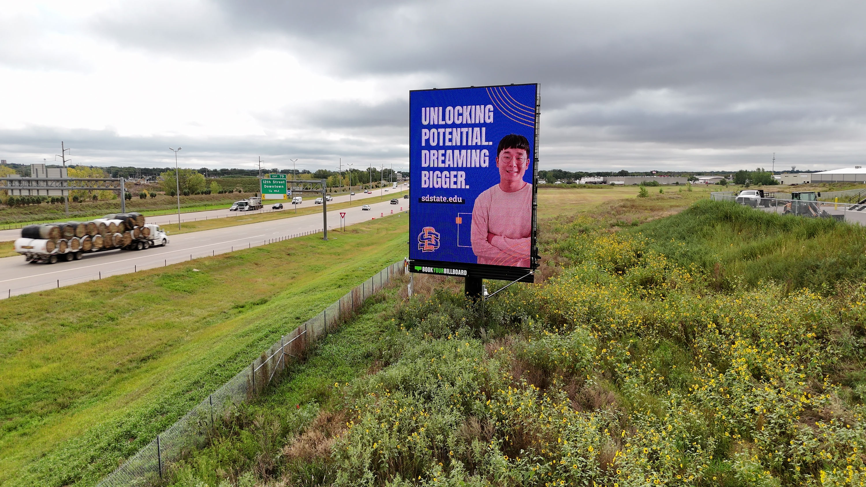
Interstate Vertical Network billboard location
Read it from the road
Use a large type hierarchy and check legibility at a realistic viewing scale. Avoid thin strokes and long web addresses.
Create separation
Give type enough contrast from the image behind it. Test both bright daylight and night viewing; local surroundings can change the perceived color.
Design for the face
A wide Viaduct bulletin and an Interstate Vertical have different composition needs. Build for each ratio, then export the exact final dimensions.
From screen to street.
- Remove. Cut any phrase or graphic that does not help the central idea.
- Reduce. Shrink the creative to a small preview and test instant comprehension.
- Adapt. Re-compose for each required aspect ratio instead of stretching one file.
- Check. Use the specification finder, then request final production approval.
Further reading: OAAA digital OOH best practices.
Ready to put it in context?
Explore the live tour and review your concept on the route it was made for.